
- 11 December, 2018
- -
- Web Editor
- -
- Architects in Barcelona, Architects in Spain, Blog's intention, Construction, In process, Mediterranean Architects
- -
- Color in Architecture, mediterranean architects, spanish architects
- -
- 0 comment
Color in architecture plays a key role. It’ s responsible for stimuli that we feel both consciously and unconsciously. Architects like Gerrit Rietveld and Le Corbusier have shared an affinity for color as one of their trademark elements. Let’s go over how they have used color in specific works.
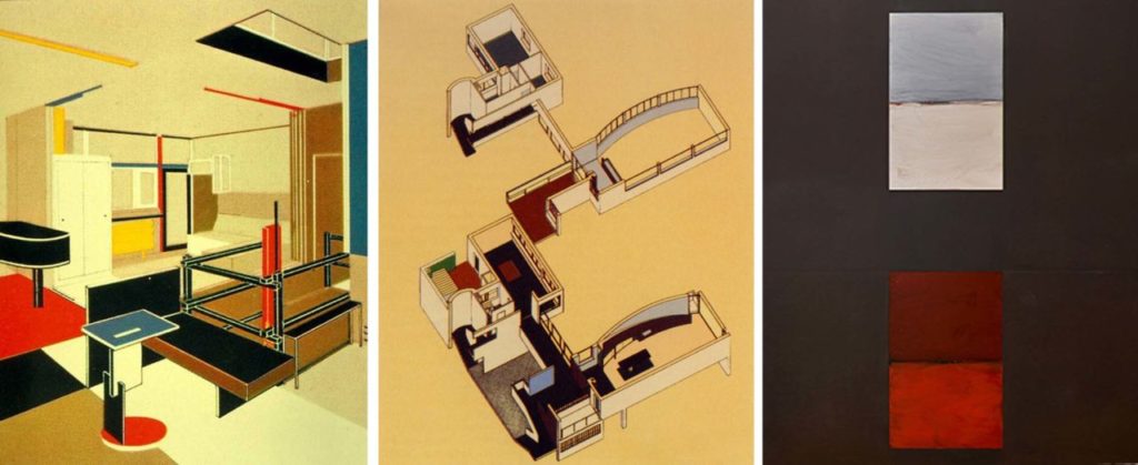
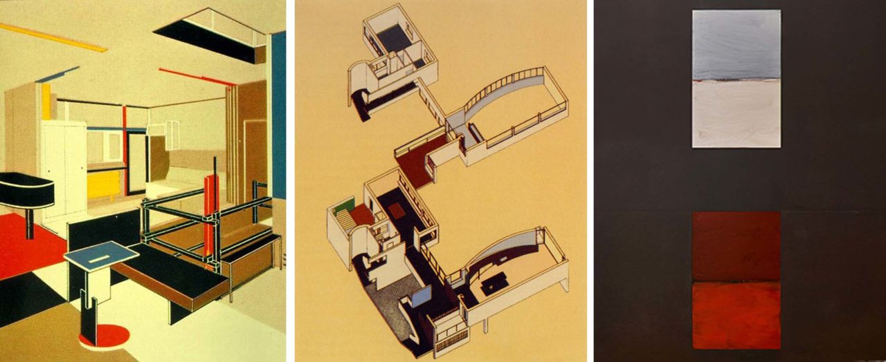
GERRIT RIETVELD: Schröder House, 1924, Utrecht
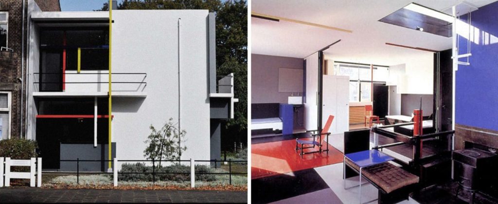
Schröder House – Principal façade and interior view.
This was the first architectural manifesto by the De Stijl group, and one of the first ever rationalist buildings.
The project was developed from wooden models made by Rietveld himself, starting from the shape of a flattened cube. From that model, he transformed the enclosure into a sum of linear, flat elements that broke up the volume.
Rietveld used color to separate different planes. Every component of the enclosure was classified through colors. He used three shades of grey, white and black for surfaces. Linear elements were emphasized through red, blue and yellow depending on their aspect and placement. As the distance to flat surfaces tends to appear to change depending on their color, each wall was treated as an entity through the use of darker or lighter shades: he placed white walls in front of grey ones to stress the separation between them, because the viewer perceives white elements as being nearer than darker ones. Woodwork and lintels were painted black for a different visual effect: during the day, light is stronger outdoors than indoors, which makes glass look darker and disappear altogether. At nighttime, as the light indoors is more powerful, the black elements melt into the darkness of the outer walls. Color is used indoors in the same way as outdoors.
LE CORBUSIER: Villa La Roche, 1923-1925, Paris
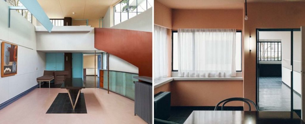
Interior views, Villa La Roche.
Le Corbusier played with the specific reactions of colour to guide the viewer’s readings of space towards his preferred meanings. He described blue and green as the colours that create space, pushing the walls away from the spectator and generating their own atmosphere. In contrast, he considered red, brown and orange to be shades that fix walls in their actual position, building up their dimension and emphasizing their presence, making them feel nearer.
He used colour to individualize a particular element within a space, to make the boundaries of said space closer or wider, and to alter the senses.
In the exhibit room, colour helps space’s elements become more independent and arranges them into an intended hierarchy. A bright colour highlights the exact placement of the ramp; the lighter shades of the item under the upper circulation emphasize the feeling of wideness; the flooring cuts off under the main table, bringing it to attention.
SEAN SCULLY: Restyling of the Santa Cecilia Chapel, 2005, Montserrat
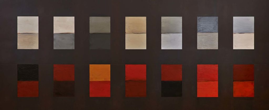
Doric Nyx, 2013. Oil on steel.
Scully designed for this space a series of panels similar to “Holly-Stations”, a personal interpretation of the fourteen Stations of the Cross. Upon entering, what is striking is the dark and imposing triptych Doric Nyx, which stands out, not only for its size but also for its religious atmosphere and austerity.
Fourteen insertions are embedded in a heavy panel of rough steel and represent the Stations of the Cross, fourteen moments of the dramatic ascent of Jesus to fourteen moments of the dramatic ascent of Jesus to Golgotha: a human tragedy symbolized by the bloody and earthy colors in the lower row that contrasts with the redemption, in the bluish celestial colors above.